Context & Research
My first workshop with John was to focus on creating our own typography through sketches and colour. I recently discovered one of the most modern typography styles created in the Bauhaus movement (founded in 1919-1933). This worked with the grid systems and circular composition to create something that will always be modern and will be followed for future designers. I love how both of these typography are still very relevant now as in the top image the b is very similar to the beats logo created in 2008. |
| Bauhaus Design (1919-1933) |
 |
| Beats logo & typography (2008) |
 |
| Bauhaus Design (1919-1933) |
The Workshop
My workshop with John consisted of working with rendering typography. We was given typography examples that we could use for inspiration in order to change this to be our own. I designed three different styles of typography, all different to each other to see the difference and effect they would have. Below shows all my typography at the end of the session.
First Typography Design
 I choose this style from inspiration of one of the sheets. I like the idea of the text getting bigger and I think this would look interesting when trying to make a word stand out when selling something or in a magazine and I also think it would stand out when working with words like"BOOM, POW" (any type of word that uses onomatopoeia).
- Love the boldness of this don't think it would work well with thin text
- I think the colour of the text is what makes this stand out as this is very dominant for example colours like red, black, brown rather than yellow and pastel colours.
Colour - The use of the black creates a very dominant feel to this typography and would look good on a blank page or a very minimal design. This type of design due to the sizing of the letters being different from one another would be good to represent one word for example the "Adidas" which could push this to be the centre of the poster for the viewer.
Composition - I love the way this design uses a range of different sizes as this typography would allow me as a designer to prioritise certain words for example if this was a sentence If I had the words "Do Not" I would want to make "Do" smaller and "Not" bigger to highlight not to do something.
Emotion - The emotion in this typography makes it become really dominant and in your face to encourage the viewer to do something. Due to the dark colour and the force that this typography has it could make someone feel they are being pushed without necessarily knowing it.
Digital
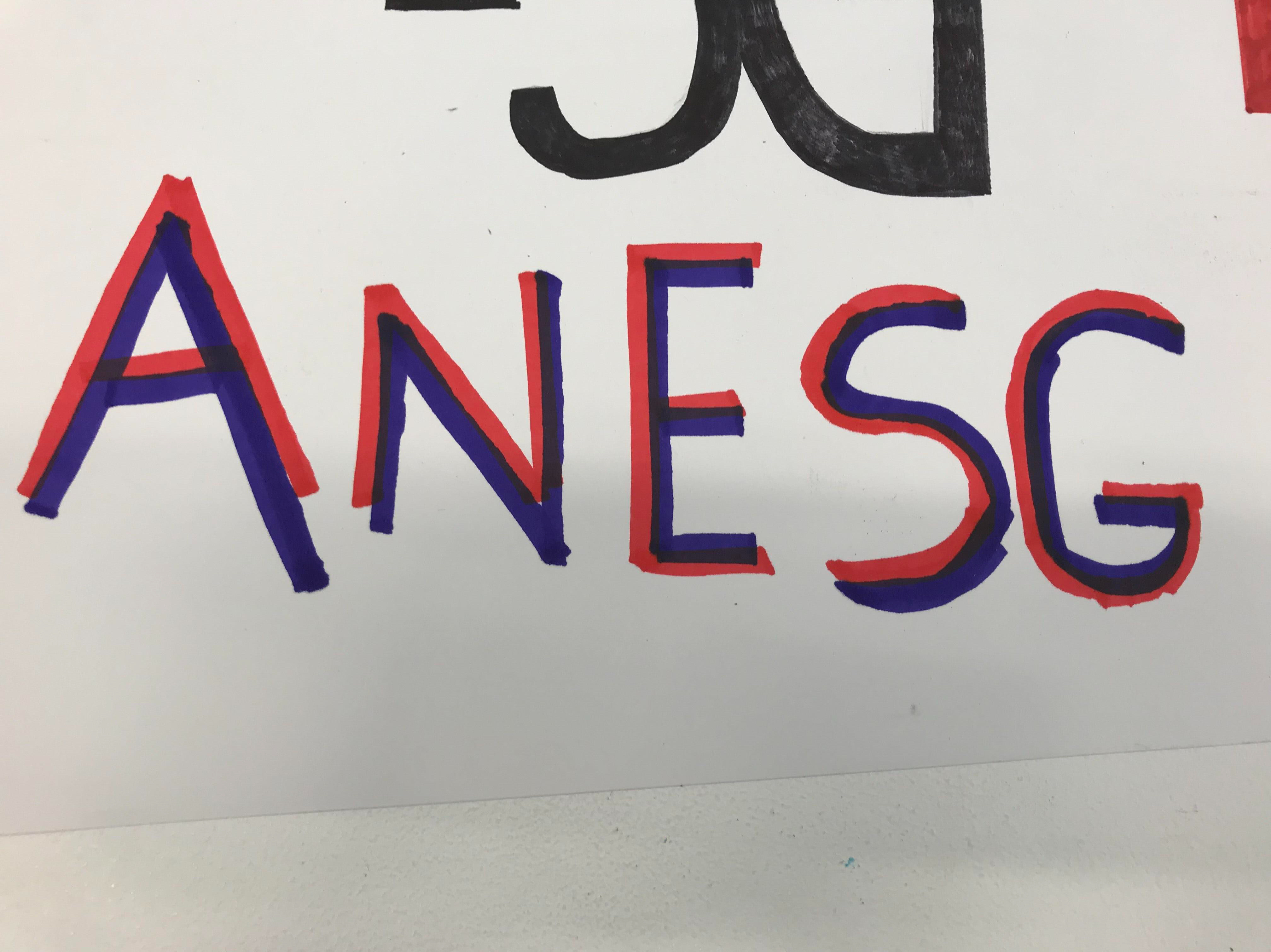
I decided to have a go at bringing this to life in Adobe Illustrator. I worked with the font "Arial Black" and decided to distort this to create a font that can represent mine to allow myself to have an idea digitally what this could look like. I have found that I will need to have a think about how I link each letter together in order for it to look like a real font. I also found that this might only work with two letters per size for example "AN" one size, "ES" another size "GH" another size and so on, although the E does create an asymmetrical effect separating the "AN" and "SG".

Second Typography Design
 This design is something I have mixed emotions about. I really like the idea of the arrows and the typography however I think if the background colour was a blue or green it would have a complete different effect. This reminds me of a warning however in another country for example China, the colour would show the idea of luck. I think the colour is very dominant and from personal choice a green would make me think of recycling or a blue would make me think of water and pureness.
Colour - I really love the use of the two tone colours making the words stand out and become more visible. However it does start to create the idea of a flag to me and the idea of danger which I am unsure about however I could try different different colours and even work more with the idea of a mellow colour for example yellow, orange or green.
Composition - I like the composition however again I feel like this creates the idea of a flag. It would be interesting to see if this colour work as a circle, square and any other shapes. I wonder if this typography could have a bit more negative space of even the idea of the typography being really big and some of the words being lost.
Emotion - I think again this has a really forceful and dominant voice which would be good for an advertisement or for me as a designer to get a point across.
Digital
I was really excited to see how this one would turn out as I wanted to see if my initial ideas was right on how this could look too overpowering and dominant. I decided to create this using the colour black for the text on a white background, then applying the red background but also followed by white text on a cheerful turquoise background to see if the colour makes a difference. I think the arrows work strongest for the letters with a slightly more circular composition for example: S and G than A & N which follows more of a straight composition. This typography might only work strongest for circular style letters which could be a problem as a full font could not be recreated. I do think the choice of colour has a big effect on the font as the red starts to symbolise danger to me however the blue starts to create an upbeat fun typography that is very chilled and calming.


Third Typography Design
This was a really simple design that took me a few minutes before finishing as I didn't have much chance to play with colour My thoughts of this is I like this for an idea for a club or a sign. I think the colours would have worked better being more vibrant for example bright blue and red.
Colour - I love the use of two tones for this simplistic style of typography. I do think it would be interesting to play around with colours to see which colours work with which and which ones don't. It would be interesting to create this digitally and also through mixed media to see this and acknowledge which colours are strong and which ones are weak.
Composition - I love the simplicity of this, this is what catches my eye straight away. I do not want to loose this if I choose to take this design forward.
Emotion - I think this has a different approach to the other two designs as this one is more fun and playful, I could see this for a club advert or something fun. I could not see this for a politics advert but it would be interesting to investigate into typographies similar to this and what they have been used for.
Digital
I decided to create this digitally using the Din Alternate Bold font. I worked with kerning the typography and creating a slightly bigger gap to give each letter some independence. I worked with three different styles this could look. The first two are very much more simplistic and I thought maybe two basic. I decided to create a sense of 3D for the last one where it could stand out and create the illusion that it is popping out the screen.


Inspiration

I was intrigued as to if any other designers created anything similar and I came across this. Although mine is slightly more thinner, it was interesting to see the use of the two colours and how they overlap each other to create a deeper darker colour. I really love the way this designer has created this and how it is a fun colourful typography that would look great and follows the simplistic Bauhaus design.
Digital Based on my Inspiration

I wanted to put my own take on my inspiration for this font and choose to work with a lower case much closer together font using three colours. I liked the idea of how everything was placed over each other and this was something I wanted to try and recreate although I did not want to copy this therefor I opted away from the text being see through when on top of each other. I think this typography has a lot of potential and a lot still can be tried yet.
Conclusion
- My favourite Is the first design due to the boldness and simple colour.
- I think the second one reminds me of danger or warning too much and this is something I will find it hard to get out of my head now.
- The third design colours need to be more vibrant as it looks quite dull because of the purple.
I am excited for my next workshop to move my ideas forward.
Comments
Post a Comment