
Typography Workshop with John (Workshop 2)


In my second workshop with John, we looked at creating the alphabet with our 3 chosen typography designs from the last workshop. I had designed 3 completely different typography designs so I felt this might be really complicated as I only worked with a few letters last time.
Typography isn't something I've been involved in that much in the past as I usually focus more on colour, composition and other similar elements however it was fun and challenging to have a new focus.
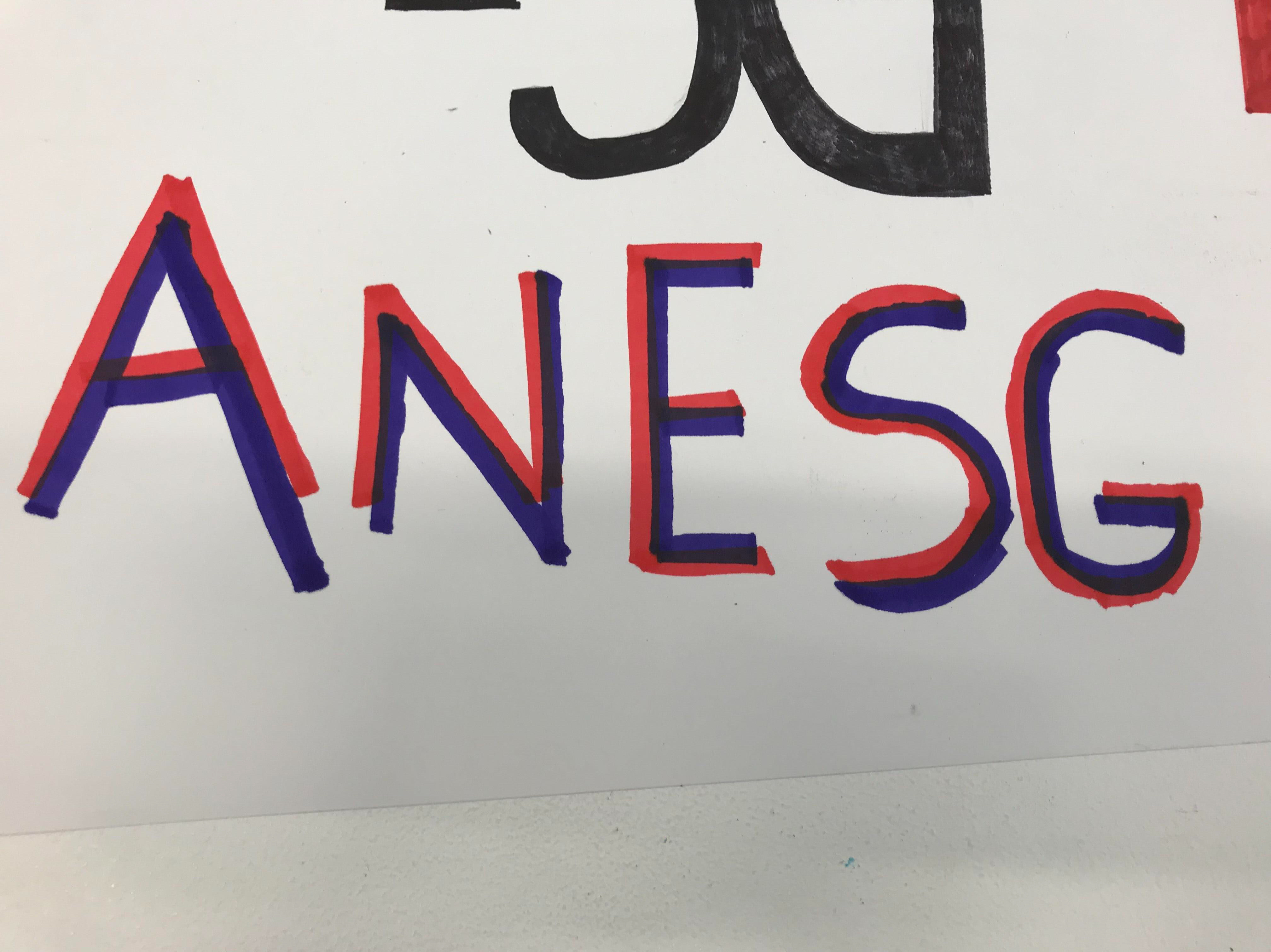
Below shows my typography designs from my first workshop.
Anesg5
anesg1.jpg

The Workshop
Typography 1
I started off with my first typography design, this was quite grungy and bold. In every letter, an arrow was present so the challenge in this case was how can I get the arrow to be involved in the typography without it looking too much or out of place. I decided for the letters that curved more that the arrow could curve inside for example C or G. For letters that was more straight lined I decided that a line could be included with the arrow at the end for example A,B and D. I really liked this typography as I thought it was fun and really cool. I could see this being used with street signs, metro links and public transport as it represents the line that trains or busses follow.


Typography 2
This is my second typography design in the style of the two market pens. I decided not to use colour to show this as then this design could be created with different colours available to pick from. Also I wanted to make this really neat and easy to see to give me an idea where the colours would go. I really like this as I think this is really fun and the design follows a lot of linear work. I think this is really fun and could be used with neon style colours for night clubs and similar party events.
Typography 3

For the final typography, I decided to change it so it wasn't big and bold as I have already had the past two follow this style. I decided to do this one handwritten with curls coming off the letters. I felt this was a French style typography and was very fluid and fun. This typography doesn't seem to have any limitations which is what I liked the most about this. This type of typography I could see on wedding invitations or even for cake companies or florists. I think this typography is more focused on women and women brands.

Conclusion
My favourite typography is the first one as I think even though it was very time consuming, its really grungy and fun. I also love the idea of this being used on railways and public transport.
My second favourite is the second one as I like the idea of the use of neon colours and also how some of the letters for example C has the letter inside it several times which shows the idea of repetition with the type.
Finally my last favourite typography is the last one, I think this is because of personal preference as I work with more grungy type of typography as calligraphy isn't something that stands out to me or interests me a lot.


Comments

Popular posts from this blog

Typography Workshop with John (Workshop 3)

In my workshop with John it was all about refining. However I had to make the big decision as to which typography I would continue to pursue. In my previous workshops, I designed the following: Here I have a range of three different typography designs. The first one is more geometrical and fluid at the same time yet follows the structure of my inspiration throughout. The second one also links back to the inspiration however I am unsure on some of the letters for example the C. Finally the last one hasn't followed any inspiration and instead was my own type that I wanted to try. I do like it however their was no process or stages for this one. I decided to refine the first one as I have seen it develop thoughout. I developed this on graph paper, below shows the outcome:  I choose to have some letters slightly thicker than others for example the M & N is thicker than U and V as I know this is a more used letter and I wanted it to be more dominant. I like ...

Editorial with Stephen (Workshop 2)

In my second workshop with Stephen, the main topic was Editorial design. We was focusing on the US standard size for the size of the In Design spread. What is editorial design? Editorial design is for magazines and websites. Once designed, this would be passed on to someone to code. The workshop We started off by setting our page up. I used the following settings below: Once I set up my spread, I then pasted in the image we was using to refer too and scaled up to my margin. I reduced the opacity to 50% so I was able to see what work I was doing on top of the image. I stared working with kerning, tracking and working with scale in order to scale the letters Alanis to fit similar to the document on the back. The reason why we was playing with these metrics and spaces was for us to have more attention to detail and to work away from the default settings.  Below shows the settings I decided to go for and what this looked like. Below shows after me playing with dist...

Self Taught After Effects - Illustration & Animation Trial (Inspired by Workshop 2 with Sara)

After my past few workshops I decided to try and use the techniques I have learnt to create something of my own. I have recently been working on a new project and wanted to try and utilise what I have learnt combined with my own illustration. I decided to work with the position and animation presets in order to set the scene and create a sense of realistic movement in my work. Below shows the outcome: Milk Sea Animation from Amy Winson on Vimeo . I am really happy with this as in the past workshops I have always stayed with the idea of using text or photography and not an actual illustration. I always felt like I couldn't work with anything like this in my work as It wouldn't ever be strong enough. Although this is a short video, I am really happy with where this is going so far and I am looking forward to extending this into something longer and progressing my narrative forward.